Why Every Designer Should Invest in Motion Training
Animation and motion are becoming increasingly integral to digital products, immersive scrolling web experiences, and brand identities.
Therefore, motion training is necessary for designers and anyone dealing with movement, ranging from the simplest micro-interactions to complex videos. Animation fundamentals make the difference between a seamless experience and one that is jarring. Animation doesn't have to be fancy or complex to feel good and be interesting.
Most people can sense when something appears off, but they lack the vocabulary needed to articulate why a movement looks bad and the knowledge on how to improve it. If you've ever prototyped a micro-interaction or transition in web design and found that it didn't look convincing or as good as the inspiration you were referencing, chances are the spacing needed to be adjusted.
Timing and Spacing
Two of the most important principles in animation are timing and spacing. Timing refers to the amount of time an animation takes to complete. It's fairly straightforward; there are 23 frames in a second, and you can start and stop an animation anywhere within those frames. Spacing is a slightly trickier concept, but we can gain a better understanding through a few examples from the initial lesson of The School of Motion’s Bootcamp.
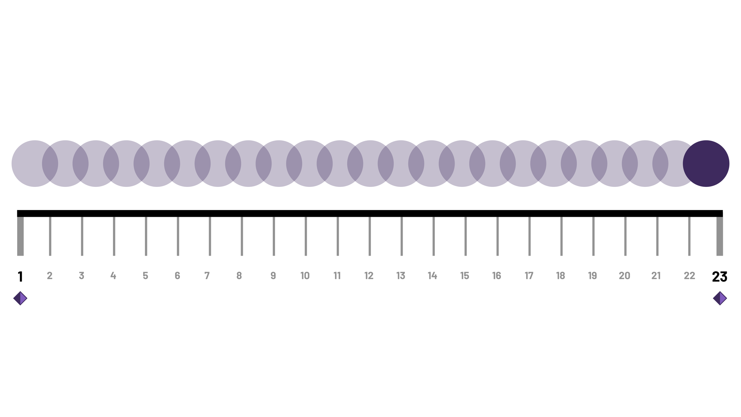
Linear spacing occurs when an object moves at the same speed from the beginning to the end of an animation. This uniform motion can appear boring or unnatural, resembling the movement of alien drones in movies. This occurs because nothing moves in such a consistent and predictable manner. Movement should involve variations in speed, typically starting slow, accelerating as momentum builds, and then decelerating as it comes to a stop. Below is an onion skin of linear spacing.
The circle appears on every frame for the same amount of time. Next, we are going to examine three additional spacing examples that are considered defaults and then compare them all side by side.
Ease-in spacing starts fast and slows to a stop. This already feels a little more natural compared to linear spacing. This movement is similar to the speed of actions like someone running and gradually slowing down or a glass smoothly sliding across a bar into someone’s hand.
Ease-out starts slow and then speeds up almost slamming to a stop. The most noticeable speed shifts occur at the beginning of ease-in and the end of ease-out, where the biggest differences in spacing occur.
Easy ease starts slowly, accelerates, and then decelerates, combining ease-in and ease-out into a single movement. The object reaches its maximum speed in the middle of the animation, although it is less noticeable in an animation this short.
This example demonstrates how all 4 circles travel the same distance over the same amount of time, and yet they are all moving differently. Unlike timing, spacing offers practically unlimited options. The distribution of spacing influences how the objects move, suggesting characteristics like the weight of the object, the environment they traverse, carried momentum, etc.
These considerations might not be as applicable if you are solely creating a hover state for a card, but they become relevant when brand guidelines specify particular motion characteristics. Being able to apply consistent motion throughout a site, from card hover states to page transitions, is essential for a cohesive user experience.
When you compare the three onion skins of easing with linear spacing, it's easy to see why those movements feel more natural. What's intriguing is that in each space where circles do not overlap, it's a distance that the circle technically skips.*
Our eyes are naturally attuned to track motion, and they instinctively fill in the gaps for what we don't see. It is truly amazing how little visual information we need to make connections in motion. However, there's enough information on that topic be a blog post all on its own.
Avoid Spacing Presets
Now that we've explored timing and spacing in motion, examining four different spacing options, it's recommended not to rely on these presets. These presets don't accurately represent the general movement of things. Imagine attempting to categorize the movement of everything in the world—living creatures, inanimate objects, and more—into just these four options.
From a matter of taste, presets are comparable to cooking. Just as using the same spice blend for every dish would make everything taste the same, relying on these presets for all movements can lead to bland results. Manual adjustment of spacing is crucial.
Next Steps
Animation fundamentals, such as timing and spacing, directly relate to digital design. A solid grasp of these aspects provides increased control in all your creative endeavors. If you're eager to dive into the world of motion and have 8 to 12 weeks to spare, I highly recommend the School of Motion courses—Kickstart or Bootcamp, depending on your familiarity with After Effects.
Footnote
*In the videos I created, the gaps are less noticeable because the circle would have to become smaller for jumps to be more apparent. This is a tradeoff I made to enhance visual interest in this format. However, the overall principle holds up in the comparison video, and the above comparison onion skin graphic accurately represents the different eases.

