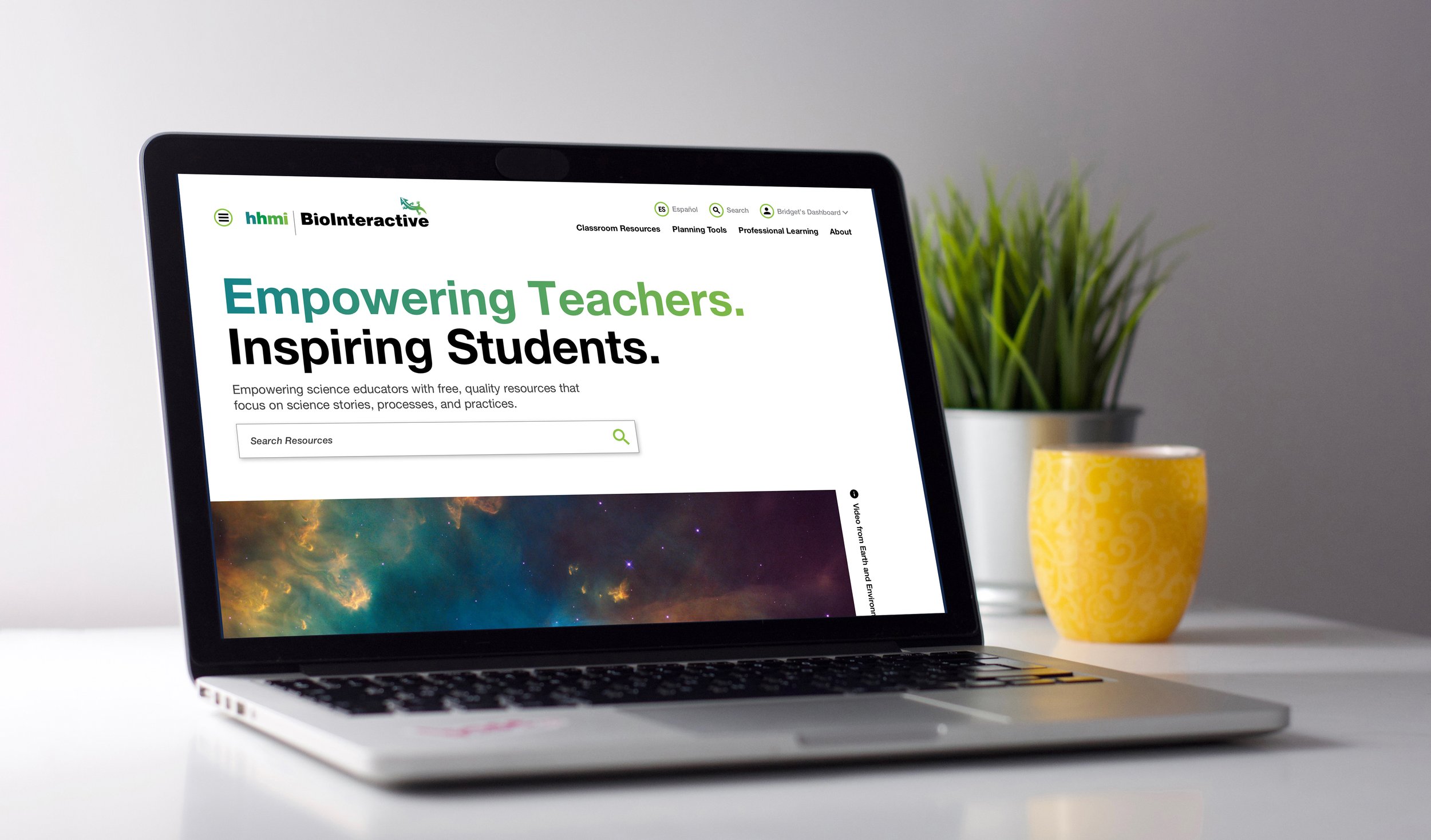
HHMI Biointeractive Web App
Overview
Howard Hughes Medical Institute (HHMI) BioInteractive provides an engaging collection of educational resources, interactive applications, lesson plans, workshops, videos, news articles, and more to help 40,000 science educators around the world connect students with inspiring ideas in biology and increase engagement with the sciences.
Working closely with HHMI’s internal design team, our team at Forum One designed and developed a robust and flexible resource library application in Drupal that allows users to search, filter, explore, and connect with content in ways that fit their unique needs. Logged-in users can favorite and share resources, and save collections of resources to custom “playlists” with the ability to add notes to individual items.
The HHMI team can also present curated playlists around current issues and themes, and easily feature individual resources on the site.
In addition, our analytics team worked with HHMI to devise and implement a customized strategy to track and analyze measures of engagement for both logged-in users and general users, to bring a new level of personalization to the experience. After the site launched there has been ongoing usability testing in addition to an accessibility audit by firm Deque Systems.
My Role
One of the goals for visual design was to elevate the BioInteractive website by leveraging the parent HHMI brand and creating a sub-brand for BioInteractive. The design team worked closely with the art director of BioInteractive outside of and in addition to the client presentation of the designs to help guide the look and feel of the site.
One of the biggest challenges on this project was creating a grid, UI system, and type scale that would gracefully flex to accommodate different amounts of information across resource and page types, while remaining intuitive and looking intentional. We used bold black type for headings for high contrast, and used bright colors throughout the site to create visual interest without relying on photos.
Our overall goal was to create a design that was as intuitive as Netflix, YouTube, or Spotify in creating playlists and navigating content. The success on this project was definitely in part to our client project manager, Bridget Conneely. Bridget managed and facilitated discussions among 10+ key client stakeholders while staying on schedule and without compromising the original integrity of the design concepts.
Project Goals
Provide a customized and personalized logged-in experience for users
Help educators plan their lessons / units / syllabi for the year
Make resources easy to find
Support discovery of related and relevant content
Support educators in professional development (events, online courses, etc.)
Be accessible, responsive, and mobile-friendly
Be beautiful, engaging, and easy to use
Target Users
Secondary Users
High school students
College students
Primary Users
High school educators
College professors
Team
Visual Designers: Jamie Bourne, Corey Jones
Art Direction: Corey Jones
User Experience Designer: Maddie Purcell
Tech Leads: Norman Bucknor, Matt West
Back-End Dev: Rose Davidson
Front-End Devs: Tommy Alter, Sathya Ram
Analytics: Adam LaCaria
Quality Assurance: Mathew Murakami, Nora Wahlund
Account Managers: Jordan Craig, Hannah Webster
Project Manager: Cole Vance
Duration
4 months
Home Page Wireframe by Maddie Purcell & Design Concept by Jamie Bourne
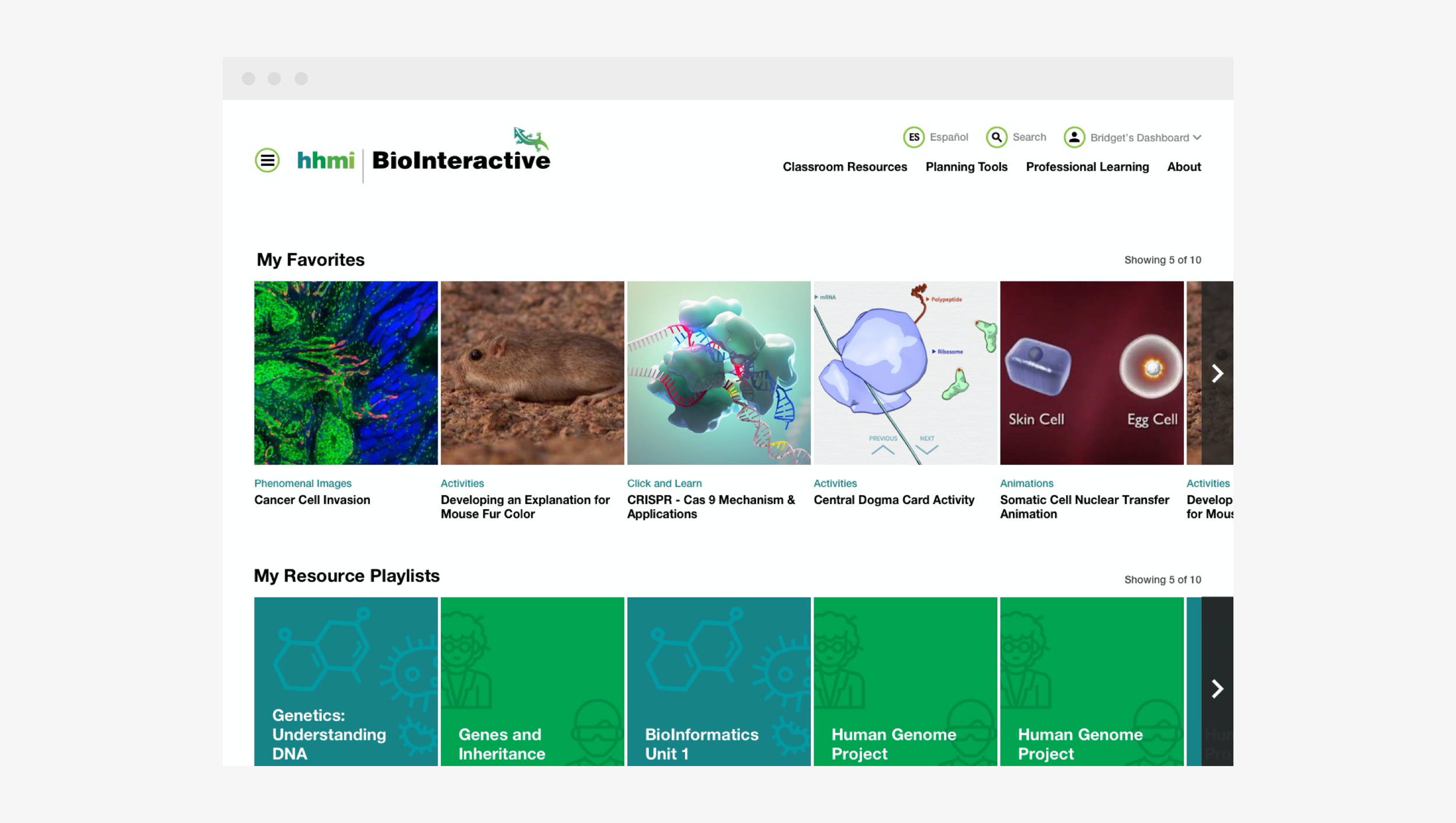
Dashboard
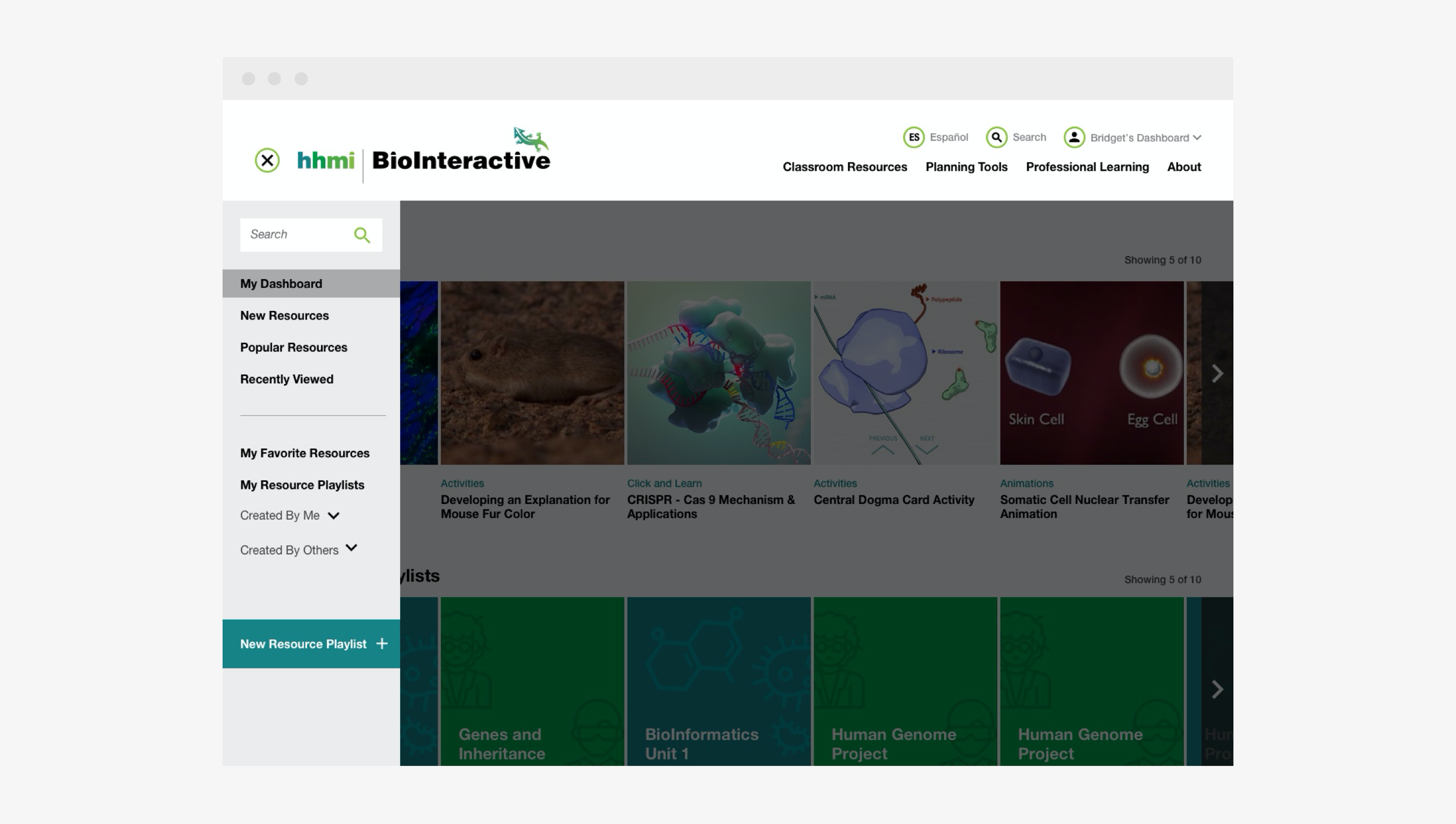
Dashboard Menu

Playlist
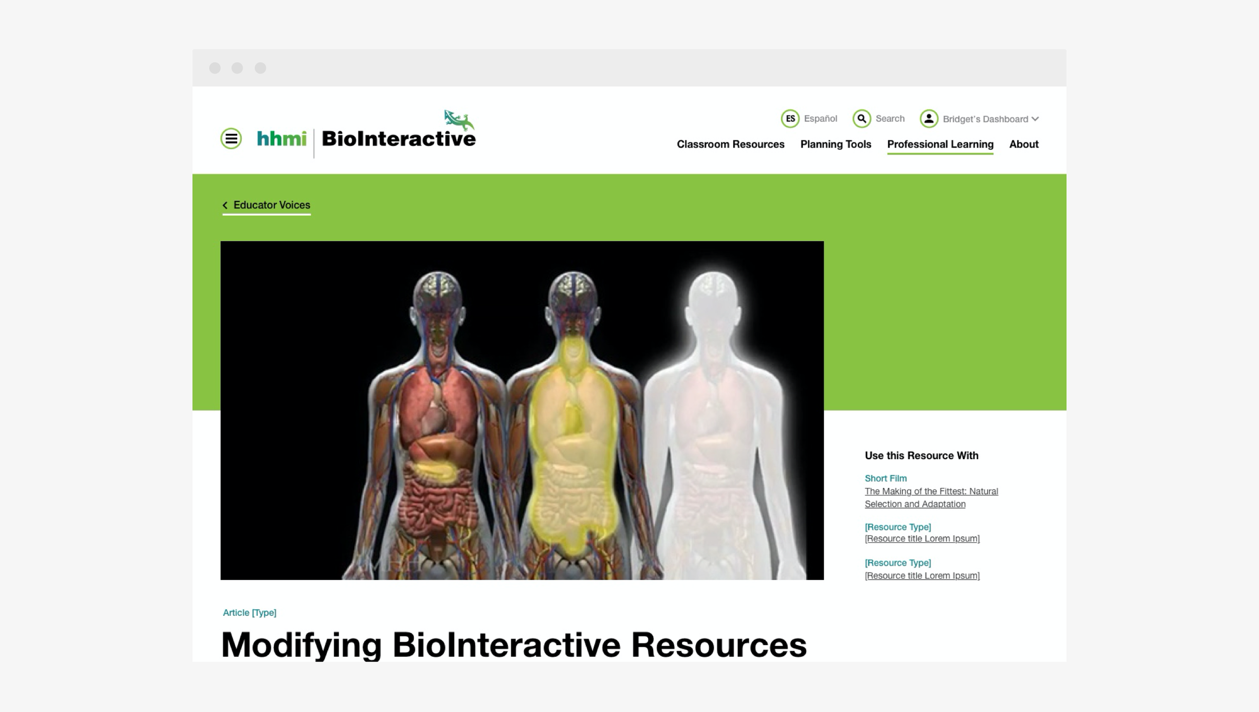
Resource
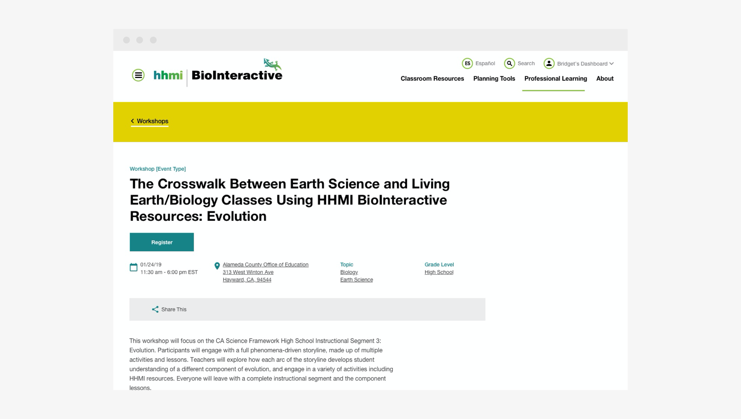
Event No Photo
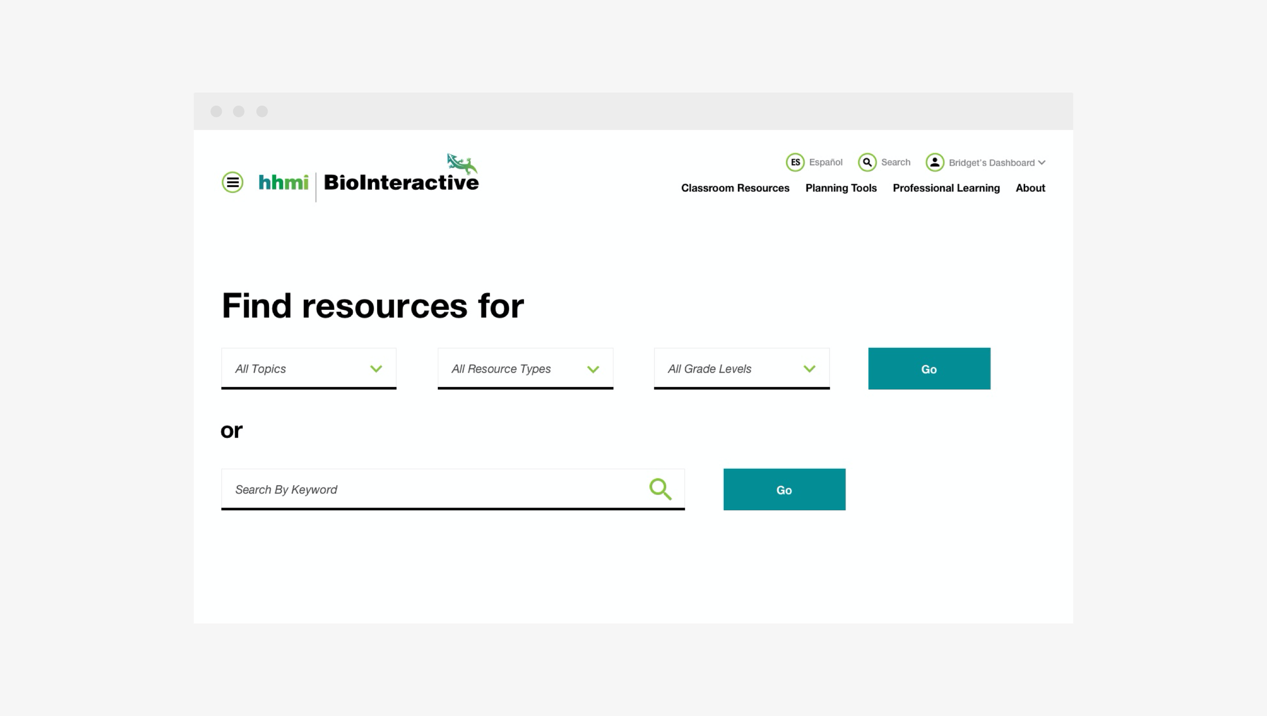
Search Landing
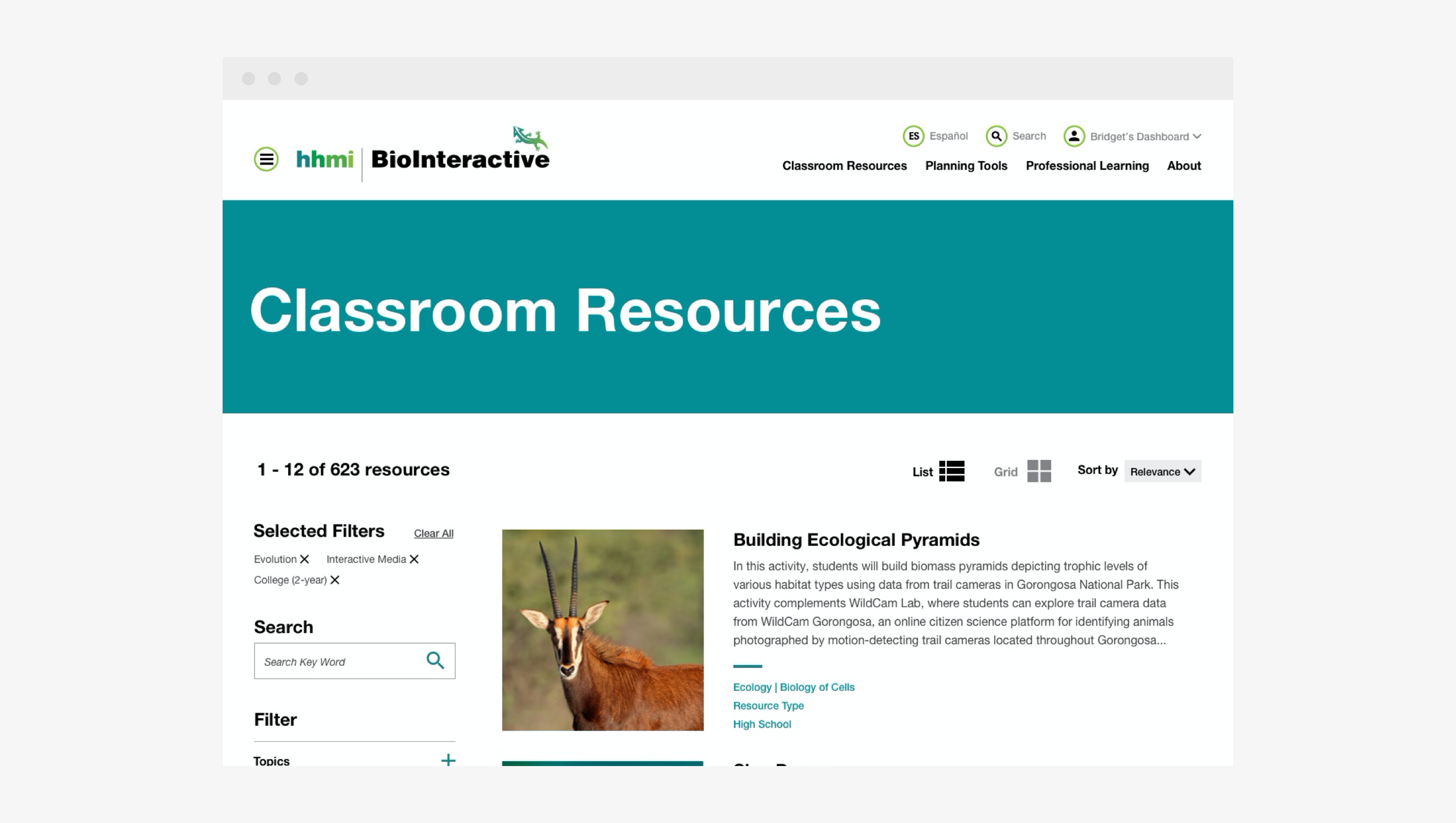
Search Listing
Design System Type Scale w/ Body Copy


